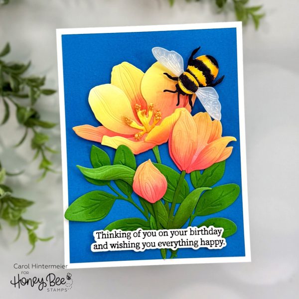
You can add additional dimension to die cut designs by applying ink blending to colored cardstocks like Carol did for this stunning floral card. She inked her cardstock before die cutting instead of after which is a nice tip for easier blending, especially for newbies. Find more details at the Honey Bee Stamps blog.
Ink blending has been a popular technique for awhile and for good reason since there are so many different ways you can use ink blending on your handmade cards. It’s a terrific way to add color, depth and dimension to images and backgrounds. If you’re not familiar with this technique it’s using a blending brush, tapping it onto an ink pad and then applying the ink to cardstock in a light swirling motion. The type of ink pad and paper are important to get good results, I prefer Bristol smooth paper or any paper with a coating that helps the ink move around a bit. Distress Ink, Distress Oxide, pigment or hybrid ink pads all work well for ink blending because they don’t dry right away and you can blend and smooth them easier. Try different products and see what gives you the best results. Today let’s take a peek at card ideas that show you all the different ways to incorporate ink blending on your cards.
Below each photo you’ll see a link, click it for more info like products used and tutorials.
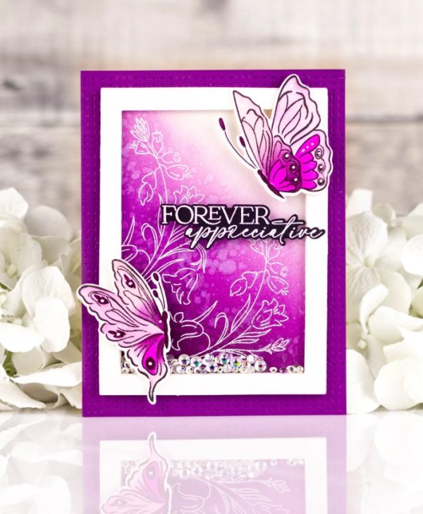
Rachel used ink blending in two ways on this vibrant butterfly shaker card. She inked the background heavier on one corner, fading towards the top, she also splashed water for a textured splatter look. There’s also ink blending on the stamped butterflies using coordinating stencils. Find more info at the Pinkfresh Studio blog.
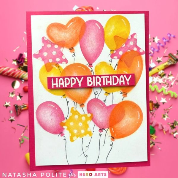
Natasha used ink blending with balloon stencils for this amazing birthday card. She used orange and pink inks to stencil and then took it a step further and used colored pencils over the inking for shading, then used an eraser to remove some of the ink for highlights, this is so clever! Learn more at the Hero Arts blog.
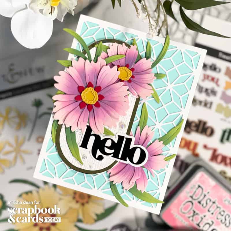
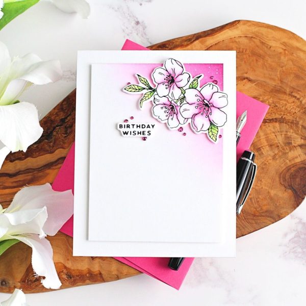
Here’s another beautiful floral card, this time from Mirisha. She also ink blended on colored cardstock. notice how the ink color is very different from the cardstock color giving her very different tones on the flowers. Mixing ink and cardstock colors gives you endless color choices and combinations! Watch her video tutorial at the Scrapbook and Cards Today blog.
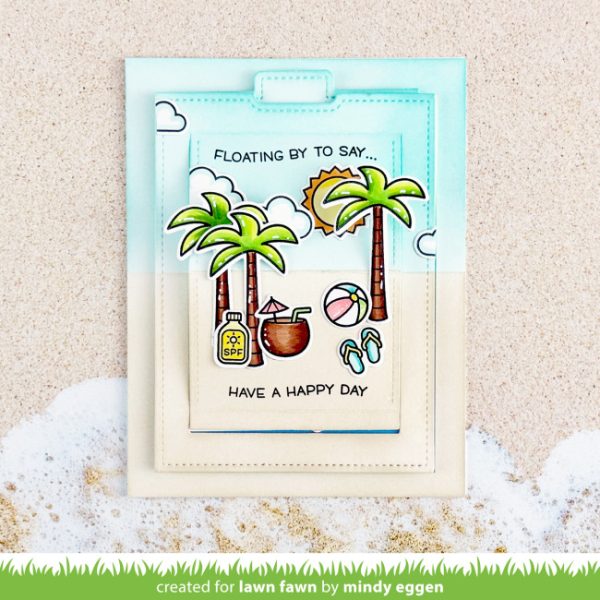
Create simple but effective scene backgrounds with ink blending. Mindy used blue ink for the sky and tan for the sand on this fun Beachy pop-up card. Use lightly tacky products like post it notes, washi or repositionable tape to mask off areas while blending. Take a closer look at the Lawn Fawn blog.
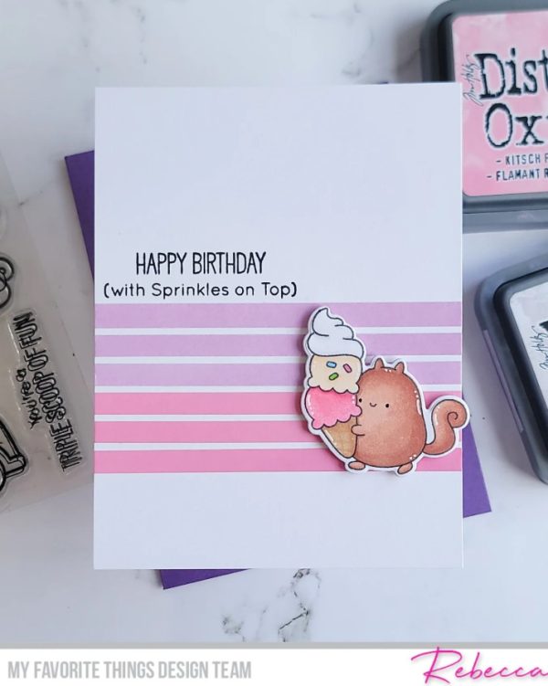
Rebecca also used a masking technique on her card but she created pretty pastel stripes on her background with different pink Distress Oxide inks. The colors really complement the ice cream the cute little stamped squirrel is carrying. Take a closer peek on the My Favorite Things blog.
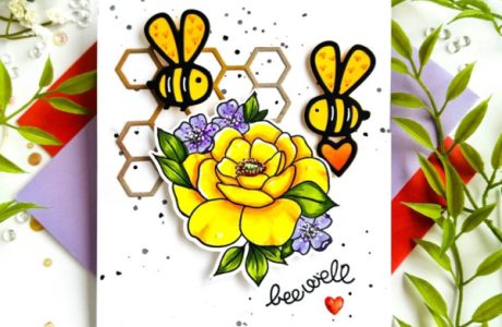
Sometimes a little ink blending goes a long way but still adds impact to the design. Michelle hot foiled her flowers, colored them with Copic markers and then die cut them and a sentiment, placing both with foam tape over the pink ink blended area in the corner. There’s lots of white space on this card but it’s balance by the bold color. Find step by step direction at the Spellbinders blog.
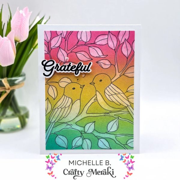
Here’s a fun take on a bleaching technique from Michele. She stamped a large stamp in black, ink blended a rainbow of colors with Distress Oxide inks and then used water instead of bleach to remove some of the colors in strategic spots for a beautiful and unique design! Take a closer look at the Creative Scrapbooker blog.
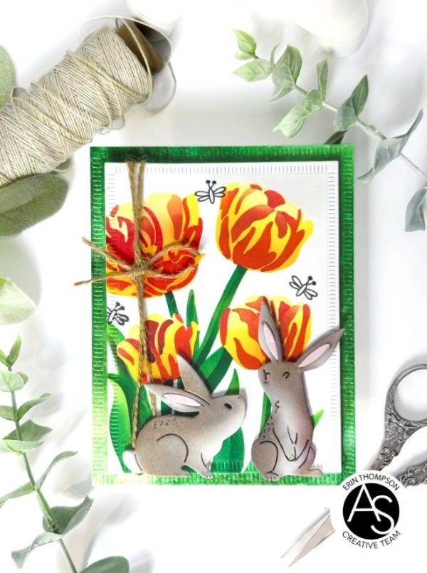
This darling bunny card from Erin has sweet die cut bunnies that she inked with greys and browns for the perfect shading. For the bold and beautiful Tulip background she ink blended using layering stencils. I love how the bright flowers really pop behind the more muted bunnies. Find out more at the Everyday Expressions blog.
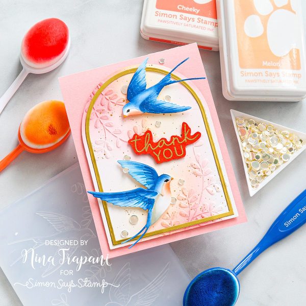
This gorgeous card from Nina used ink blending in a couple of ways, first there’s pastel inking on the dry embossed floral background panel (use a light touch with this technique) and then she used very small blending brushes to add color to the die cut birds, enhancing it with matching markers for even more detail. Watch her tutorial video at the Nina Marie Designs blog.
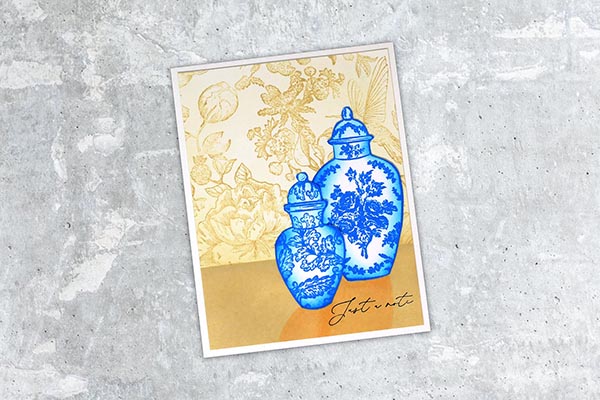
Here’s another example of how a little inking can make a big difference. Lydia stamped her vases with blue ink on white cardstock, fussy cut them and then took the same ink and blended around the edges to give a very realistic rounded shading. Watch her tutorial at Splitcoast Stampers.
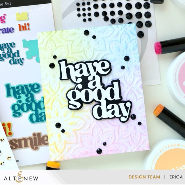
Erica used an embossing folder to dry emboss her pretty background adding a rainbow of pastels inks with ink blending. The black and white die cut sentiment and gems really stand out and pop over the softer background. Take a closer look at the Altenew blog.
I hope you’ve learn something new and will try some of these fun ink blending techniques for yourself!
-Heather
You can shop some of our affiliate companies mentioned in this post:
RangerInk is a great place to shop for Distress and Distress Oxide Ink Pads
You can find Lawn Fawn products here on Amazon and over at A Cherry On Top